Recently updated on February 6th, 2024 at 06:28 pm

How to map a website layout
Your website has the potential to be the engine room of a power marketing system for your business. While there are many aspects to consider when approaching a new web build, one of the most important is the layout design of your pages.
What exactly do we mean by layout design? You can think of layout as the story your overall design tells. Basically, what story do you want the website to tell as it unfolds or scrolls and your users engage with it?
As the world of web development and app development has evolved, so too have the techniques for design layout. While the typical main hero image and three column approach is still popular (though a little boring!) there are now many techniques and templates available to both designers and developers.
These provide creative and dynamic ways to map website layouts, giving users a variety of user experiences to generate interest in your products or services. The importance of design layout can’t be understated – most users will make a decision in less than 3 seconds about staying or leaving your website. So if you don’t capture their attention immediately, they could be lost for good.
The following article takes you through everything you need to know about how to successfully map your website layout. It will help you take advantage of current design trends and avoid making common mistakes.

Using percentage in design layout
When designing the layout of a website, a designer will have the choice between using pixels or percentages. Generally speaking, designers tend to avoid the use of pixels because they are an absolute value – it means an image or component that is 100 pixels wide won’t change on different device screen sizes or browsers. This isn’t good for responsive web design!
Percentage layouts provide a highly flexible and fluid way for designers to map website layouts. It’s just like having a group of different sized cardboard boxes. If someone says you have to fill half of each box with packing material, then the 50% will change relative to the box size.
This is exactly the same as designing for desktops, mobile and tablets and popular browsers like Chrome and Firefox. Percentages provide designers with a highly versatile method for web page layouts with many variations at their disposal for a range of screen sizes.
And just as importantly, the use of percentages is much easier for developers to code on platforms like WordPress, Joomla, Drupal and Magento.

Using alternate percentage combos in your design layout
Once a designer begins working with a percentage layout, they can slowly build the overall structure of each page with the size and positioning of content components or containers.
There are a range of factors that will dictate these choices. It includes the goal of the website, such as an e-commerce site that is all about driving sales. Or balancing the visual elements and the amount of content with user experience.
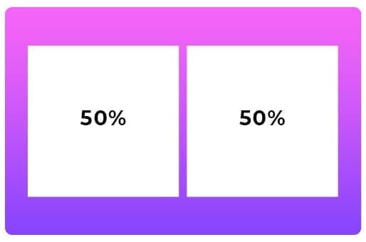
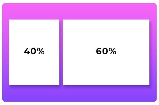
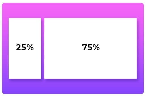
The most popular percentage combinations are:
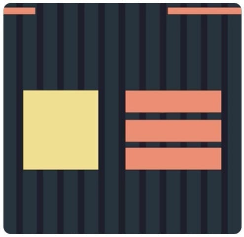
Two Blocks:
Three Blocks:
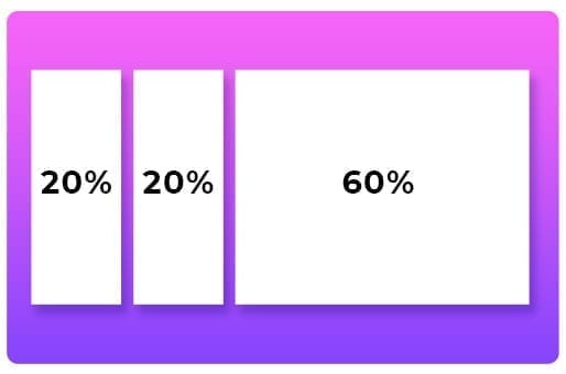
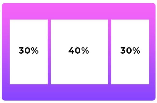
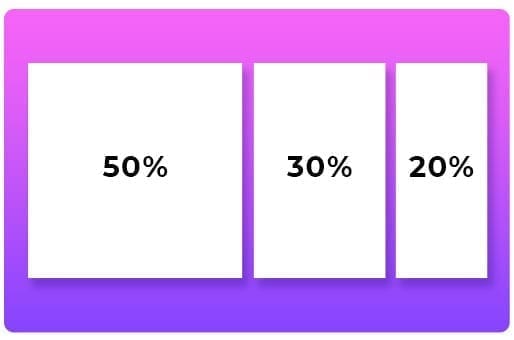
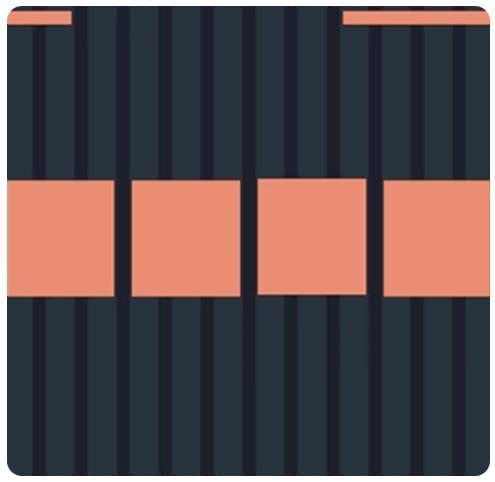
Four Blocks:

Here we can see some of these percentage combinations at work, provide engaging ways for you to layout your pages with grids working horizontally.
While humans are naturally prone to creating symmetrical layouts, some of the best designed websites take advantage of non-uniform approaches.
Remember, not every element needs to be filled with content or images. The use of whitespace is a highly effective way to not overwhelm visitors. Airbnb use whitespace in a way that provides breathing room across its website and draws your eye to the content and buttons they want visitors to focus on.
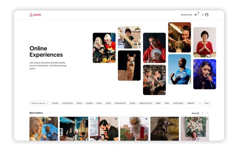
The creative use of big margins in web & mobile app layouts
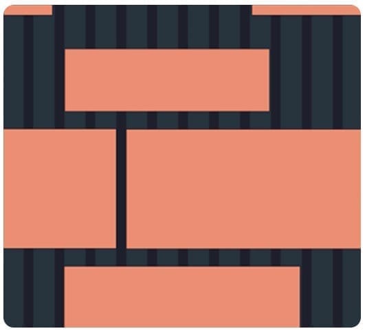
Margins are another important tool at the disposal of designers, helping to create additional space around different elements. Margins exist not just vertically on the left or right hand side of pages, but around each element on web pages and mobile apps.
For example, a heavy margin on the right hand side of 40% provides a dynamic way to generate a whitespace block and draw attention to a visual element on the left.
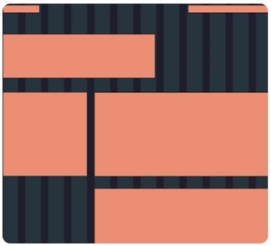
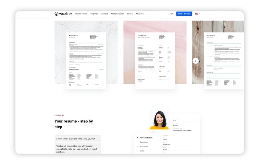
Online resume builder Wozber uses a range of different margins and overlapping elements as users scroll down the homepage. Not only does it reduce any repetitive elements that can lower user engagement, it highlights the brand as progressive for its younger target audience.
Overlapping elements technique for Layout Design
The trend toward overlapping techniques for layout design is gaining in popularity. Deviating from traditional grid lines allows you to combine two or more elements to create depth while extending the background to the entire screen.
By thinking out-of-the-box, you can create visually stunning elements to successfully combine content with images or illustrations.
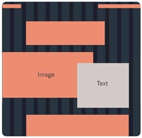
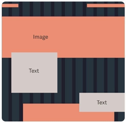
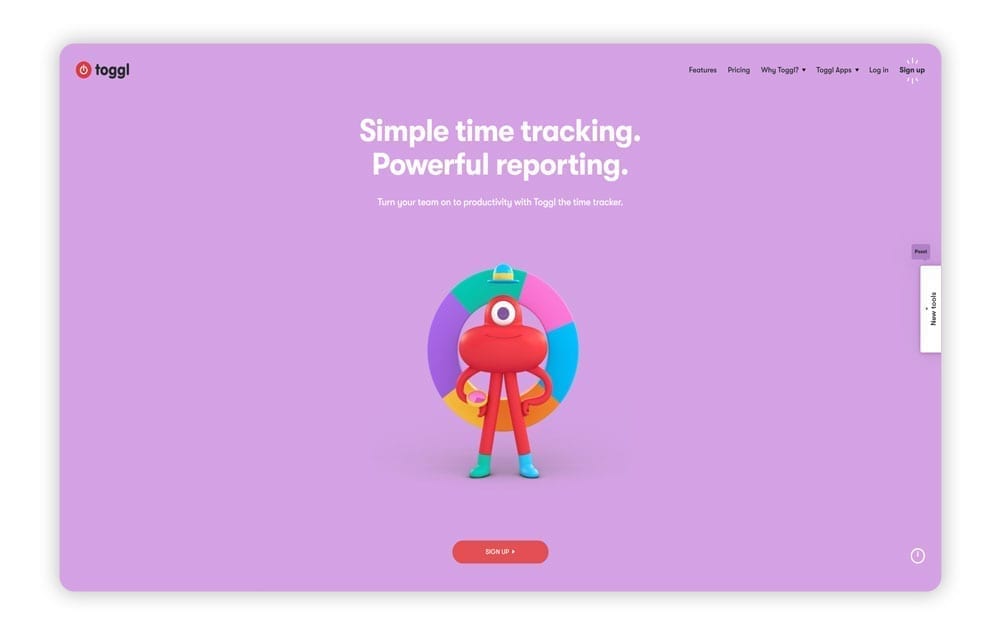
A stand out website for this technique is Project management software Toggl. They use bright full-width backgrounds with overlapping content boxes and animated characters to bring to life their product offering.
Using Emphasis in Layout Design to capture attention
This technique allows you to emphasise a single, larger element along your gridlines. Imagine you had four benefits you wanted to highlight for your business, but you knew that one of them was provided more value for the customer.
You could apply emphasis to one block or component, either by increasing its size or adding shading or borders. This is commonly used on pricing pages to draw attention to one offer above the rest.
Using movement in layout design
As websites have evolved to become visually richer for users, moving blocks into different patterns offers a highly engaging technique for layout design.
If you are presented with three or four content blocks, you might consider an alternating or cascading pattern. This can be achieved by staggering blocks from top to bottom or left to right, both horizontally or vertically.
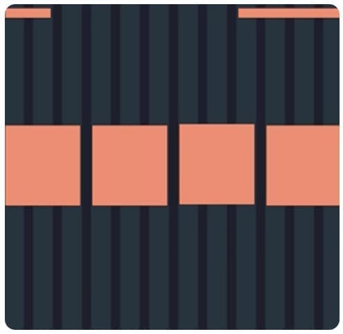
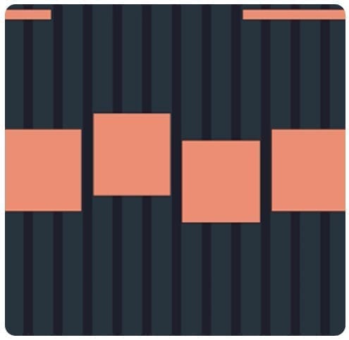
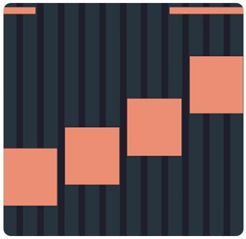
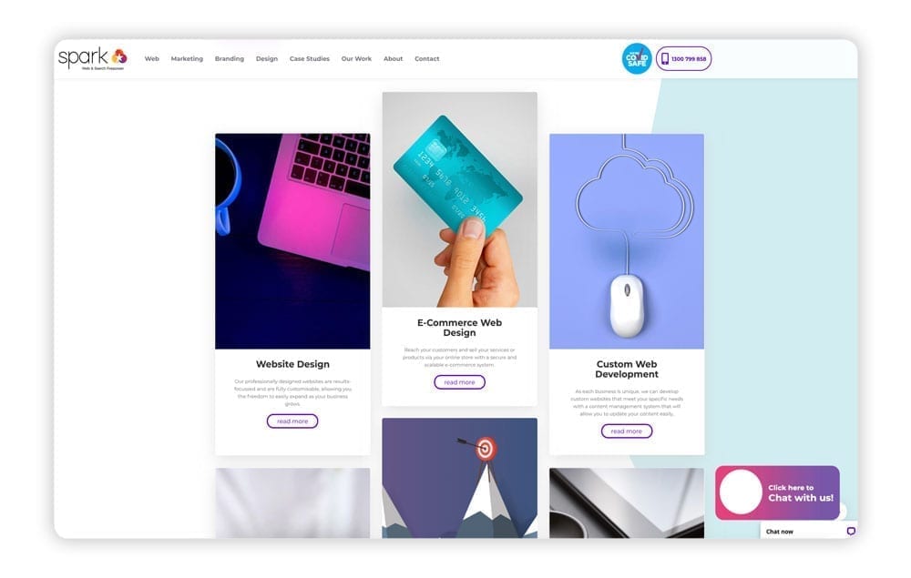
The team at Spark used this technique for our own homepage design layout. We decided to showcase our services with some subtle but creative variations in block heights and positions.
Centre aligned & left aligned technique for layout design
A simple but incredibly effective technique to create interest for your website is aligning blocks to the centre or the left.
You might consider a left align technique if you have a series of icons you want to use that sit above related content, or a centre alignment block that introduces content situated underneath.
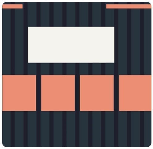
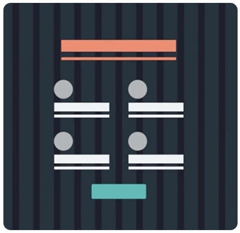
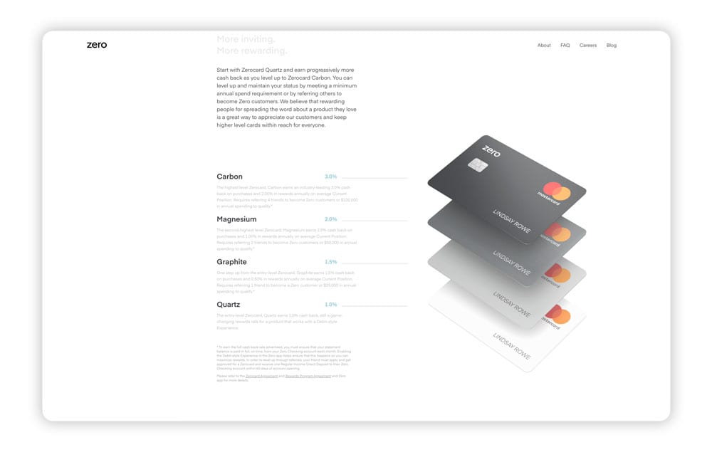
Clever banking app Zero uses a shifting left alignment for many of its blocks, offering a distinctive user experience that doesn’t make it feel like you’re reading a content heavy page (even though you are!).
Where to from here for your next web design project?
We hope this guide provided you with a great foundation for everything involved with design layout. For business owners out there who are learning more about the world of design and development for their own website, Spark Interact offers highly-flexible and affordable options.
Our web design and digital marketing agency partners with many ambitious brands that are looking to push the boundaries of website layout and design. We’d love to hear about your website needs!

