Recently updated on February 6th, 2024 at 06:28 pm
How to Choose a Branding Colour
- Decide your brand identity
- Know what different colours mean
- Research your competitors
- Build a brand colour scheme
- Test how your colours look
Choosing Colour Combinations
Common brand colour themes include:

ANALOGOUS
A few colours that are close to each other on the colour wheel. These work well together as adjacent colours usually have similar emotional connotations. While they blend together well, this may not be best if you are trying to stand out.

COMPLEMENTARY
Colours directly opposite each other on the colour wheel. As they are opposites they help each other stand out when put together. These are good for creating dynamic imagery, however are very common so you might find many brands using them.

TRIADIC
Three colours opposite each other on the colour wheel. Having three colours will offer a more variety and stimulation. It can be difficult to get all three colours to match the meaning of your brand, but if executed well, can be very effective.

MONOCHROMATIC
On colour in many shades. If you want to focus on colour/personality for your brand this can be a good way of achieving that. It is great for simplistic brands, just make sure the shades/hues of the colours are differentiated enough that it is clear for the viewer.
What Colours Mean in Branding
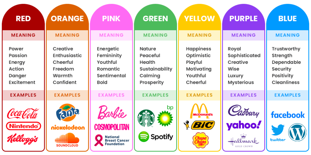
There have been a number of studies on the meaning of common colours, and how we respond to them. By now, every branding agency in Sydney has a strategic approach to colour. But for your benefit, here is an overview of the meaning of the basic colours:br
Examples on Brand Colours
Here are some recognisable brands and the meaning of their colours

While Google likes to change its logo for special holidays and events the standard logo is always recognisable. The idea behind their colour choice was very intentional. They used the primary colours blue, red and yellow to convey that they were as recognisable as the first colour chart taught around the world. But added in the green on the ‘l’ to show that “Google doesn’t follow the rules”.

Coca-Cola
Red is a bold choice for any brand to use as while it can convey warmth and passion, it is also the colour of danger and anger. Coca-Cola has been using its now trademarked red since the company started over 130 years ago. Originally sold in barrels the company painted them red to distinguish from alcohol barrels to help customs and tax officials distinguish so they could charge the right tax. The colour stuck and now when you see that red colour (not found on a pantone colour chart) it is instantly recognisable.

Tiffany & Co.
When Tiffany & Co first started their main colour was blue which came from its iconic Blue Book, it took over 100 years until the shade was closer to the robin’s egg shade that we know today. The ‘blue box’ has always had an air of exclusivity and luxury with its owners knowing the value it could have on the brand. The colour and packaging was trademarked in 1998 and now consumers can see this colour and without any other brand identity know that it is Tiffany & Co.
Cadbury
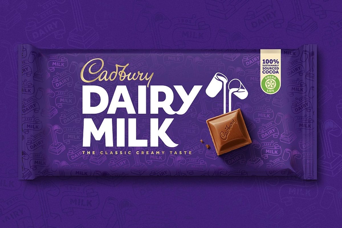
It is thought that the Cadbury brothers originally chose the colour purple as a tribute to Queen Victoria. While we may instantly associate the ‘royal’ purple with Cadbury, it has been a battle for years to trademark the colour. The brand did have exclusivity of the colour pantone for a few years, however lost the trademark in 2019.
Mastercard
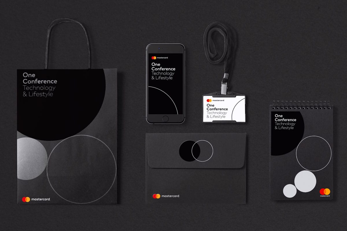
Mastercard was originally formed with the merging of 17 banks. The colours were chosen to be symbolic of this. The red was chosen to symbolise energy and vitality while the yellow was to represent happiness and prosperity. Intentionally joined in the middle to create an orange to show the joining of these values.
In Conclusion
As you can see choosing the right brand colour can help set your brands personality while also evoking feelings from your potential customers. Taking some time to think about what you want your brand to say can help you choose the right colour palette for your business, that will help make sure you stand out from the crowd.

